
A couple weeks ago, I started discussing the prototypes of Corporate America available to Political Action Committee and Super PAC kickstarter supporters. I only got through the first two, so today I’ll tell you about the remaining two, sharing some stories and design lessons along the way.
Playable Version

This Playable Prototype went to my friend Ethan Levy. Thanks Ethan!
February 25th, 2012. It had been almost three months since our last prototype hit center stage, and the game had come along in leaps and bounds! The Playable Version (a bit of a misnomer, since every version is playable… this one just has enough of the kinks worked out that it’s playable without someone to correct errors) is actually about three versions after the First Revision. During those iterations, the game had been playtested rigorously to try to smooth out as many big problems as possible.
Of course, the game was in constant flux, and this version has its fair share of quirks that don’t work quite right. But things were settling down and the game was coming along very nicely. All of the problems with the last prototype were being addressed, although none of them were completely fixed.
Lookin’ good. One thing you’ll notice is that the game looks a lot more colorful than the last version. Much of my effort was dedicated to its appearance.
But isn’t that bad game design practice? Shouldn’t you finalize the mechanics before worrying about appearances?
This is actually something I’m still figuring out. You don’t want to dedicate a lot of time to aesthetics while you’re iterating on the game, since you don’t know what will survive. Redoing art is a very laborious activity. That said, you want to be playtesting as much as you can, and you don’t want your playtesters to get distracted by confusing or dysfunctional graphic design.
Plus, I’m not much of a graphic designer or artist myself. Working on Corporate America, I was learning a ton as I was building the game. Iterating on the appearance was like doing homework. Every time I redid the visual design of the cards, they looked more like they ultimately would, and I had a better idea of what I needed from a trained artist.
Live within your means. People like to dream big. I’m no different. Many game designers are ambitious people, and their designs are ambitious right from the get go. One of the ways I was being ambitious with Corporate America was making the game for 3 to 8 players, a bigger spread than I realized.
By this point, I’d started looking into actually printing Corporate America and it was becoming more clear that physical stuff isn’t cheap. For a game to support 8 players, you need a lot of cards, which means the game is going to cost quite a bit. Including enough cards for 8 people to play meant Corporate America would have to cost more than I think most people would be willing to pay.
As I continued playtesting, another issue was driving the point home: the number of industries in the game was very difficult to scale with the number of players. There is a sweet spot for the number of industries. On the one hand, there need to be enough industries that players are invested in different industries with only a little overlap. On the other hand, there can’t be so many that industries aren’t represented in players’ business portfolios, because consumer cards that don’t relate to a relevant industry are boring and disappointing. And the sweet spot for 8 player games is different than the sweet spot for 4 player games. I toyed with the idea of players removing cards for smaller games, but seriously, what a drag.
So, both gameplay and physical restrictions pushed me to drop some industries from the game, but which which ones? It was a tough choice… I liked them all. In the end, education and clothing had to go.
Thematically, education is one of the most shaky industries, since few people think of schools as an industry. Additionally, many education businesses had special rules, so cutting them simplified the game, something I’m always trying to do. The education business special rules were creating some confusion anyway. So out went education.
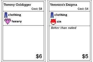
I actually think these jokes are tight, but that’s all the material I had for clothing.
Why clothing? Honestly, it’s mostly because I had a really tough time coming up with ideas for clothing businesses! I just don’t care about clothes enough. While I did have a few businesses that were funny and crowd favorites, many clothing businesses just weren’t that great and wouldn’t be missed.
Before I move on, I want to mention that I’m not giving up on this ambition quite yet! I don’t know if it will ever be made, but I’ve started working on an expansion for Corporate America called Military Industrial Complex. One of the big goals for the expansion is to provide enough cards to support 8 players, and education will probably make a triumphant return as well.
Less is More. When designing a game, one is often tempted to solve a problem by applying bandages (adding more rules). The Playable Prototype has a pretty quirky example of this related to the protests.
Protests are important for the game. Thematically, they are a total necessity, as politics and protests go hand in hand in many people’s minds. Mechanically, protests also play an essential role: they limit the power of the president, they keep the value of the presidency variable, and they force legislation that no one would pass otherwise.
The problem? At this point, protests worked like consumer cards. If you flipped one, you could play it instead of a normal consumer card, but you had to pay to get another option. People hated that! Imagine paying to flip a card, seeing that it’s a protest, and realizing you’re not going to get any bribes. What a lame turn!
In this version, I tried fixing this problem by adding a new rule. Protests still forced legislation of a specific ideology, but they also boycotted another player’s business. For example, environmental protesters would force environmental legislation, plus they let whoever chose them to block a polluting business from making money. Now you get to do more stuff when you play a protest. You get to be mean! Fun, right?
Actually, not really. This idea proved to be too complex, didn’t really make the protests any more attractive, and didn’t work thematically for many of the protests (which businesses should conservative protesters boycott?). Boycotting protests only appeared in this one prototype.
The next solution I tried, which made it into the final game, is to just make a protest happen whenever it’s revealed, then to let the player who revealed it flip another consumer card. Instead of adding rules, I made the game simpler: the player no longer has to deal with a boring choice. I should have tried this before applying bandages, but complexity can be pretty tempting.
Programmer Art Version

A Programmer Art Prototype for my good buddy Oliver Marsh. Thanks Oliver!
The final prototype kickstarter backers can choose is what I call the Programmer Art Version. It’s named after the common practice in digital game development of programmers putting their own ridiculously bad art into games before final art is added. Of course, as I discussed for the last version, I was trying to inch my way toward final nice looking art, but it was clear that a lot of my art just wasn’t going to cut it (as one of my friends lovingly said about the presidential eagle, “it looks like a little kid drew it!”).
This version of the game is from June 3rd 2012, and the mechanics were pretty nailed down by this point. Little changes were being made up until the game finally went off to the printers, but these were mostly just numbers going up or down to make the game play better–the game system was more or less complete by this time, and further development on the game was mostly to make it look good. So what needed to change with this one?
Visual differences need to indicate functional differences. I wanted different businesses to have different styles. I knew it was unlikely that businesses would have unique art on them, partially because there were so many, and partially because there was so much information on them already that dedicating card real estate to art would be impossible for some of the cards. But I still wanted them to have some personality. So I defined a few types of businesses (like edgy and classy), created different templates for each one, and assigned each business to one of them. This made them look a little different, but didn’t take up much space on the card.
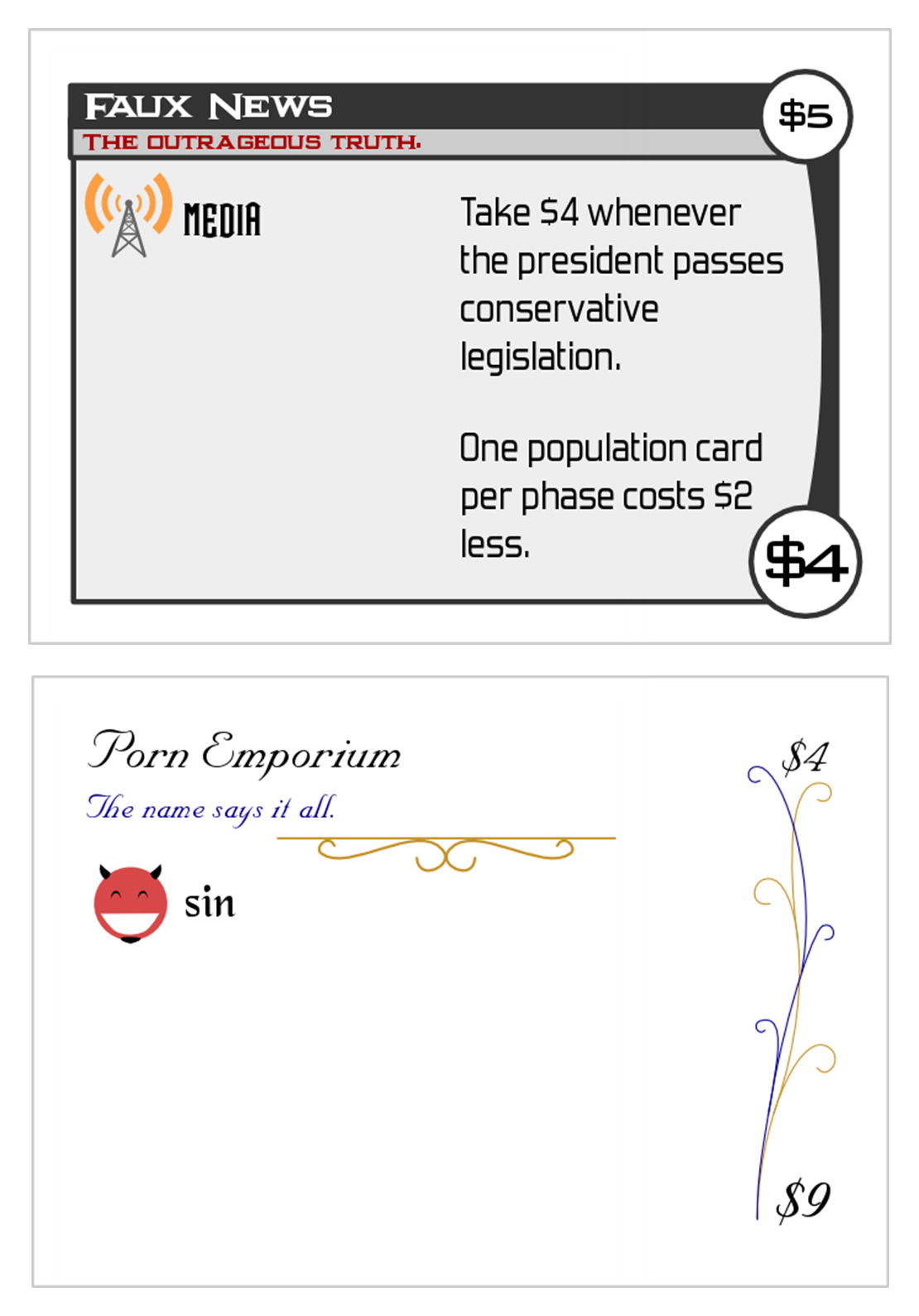
An edgy and a classy business. Believe it or not, these come from the same deck.
I dedicated a lot of time to getting these different styles to work, and I liked how they brought a little variety to the business deck. Businesses were in different styles all the way through the kickstarter. Unfortunately, questions about why the businesses looked different came up in almost every playtest, and people on the internet even expressed concerns about it. The world was against me, so I had to concede that different styles didn’t work like I’d hoped.
In the final printed version of Corporate America, businesses will have all the same style. I’m a little sad about this, but at least all that practice making lots of different styles helped me learn enough about graphic design that the final version of the business cards turned out pretty good!
Rough drafts for everyone! While my art didn’t quite live up to the standards of modern board games or even kindergarten finger paintings, one thing it did do very well was model what I wanted for the final version. Take, for example, the legislation cards. By redoing them repeatedly myself, I discovered an aesthetic that worked well (a news network metaphor), and I created approximations for the “political cartoons” I wanted for many of the cards. Once I found an artist to help me illustrate the cards professionally, I was able to send her the current versions as reference points for her own work. Taking the art as far as I did meant getting the final art went much more smoothly.
Still too ambitious. One area where the final art couldn’t live up to my programmer art was the board. By this version of the game, I wanted the board to look a little like a Where’s Waldo illustration, with lots of characters and hidden jokes. I created a rough version of this (grossly simplified and gross looking), but I didn’t realize how much work a production quality board like this would require. Ultimately, I couldn’t find an artist to help me realize this vision of the board, and the final board is much more abstract and simple.
Iterating for Life
Believe it or not, this isn’t even the final prototype! The next and last big prototype was used for the kickstarter, which led the way to the final version that went to the printer. Each prototype fixed issues, but also revealed new problems. Some of them experimented with solutions that went no where, while others discovered elegant fixes that survived the test of time.
I don’t know about you, but I can’t wait to see the final version of the game in a few months!
Sparky
/ February 13, 2013I also can’t wait to see the final version of this game! As a student in the “public” education system in America, I think the idea of education as industry is pretty hilarious, so I’m glad that education is in the works for the expansion that might be. Also, I remember that board, but I think the final version is actually quite good, and most of the fun is in the cards anyway, so maybe a simpler board is better. ??